Energy Maps were first devised by Dr. Douglas Hill for the Energy Technology Systems Analysis Programme (ETSAP) of the International Energy Agency to illustrate the relationships among such variables as primary energy, fossil fuel energy, carbon emissions, Gross Domestic Product, etc.(1) Typically, the logarithm of the ratios of the variables are plotted which take the form of a family of straight lines usually with a slope of + or - one.
The same technique may be applied to illustrate graphically the consumption of gasoline in cars. There are two equations embracing such variables as the total gasoline consumption in litres (F), the total number of cars in the fleet (V), and the average distance travelled by each car in kilometers every year (D).
Since F = F/V * V, the logarithmic form is log F/V = log F - log V. This equation is a straight line of slope + 1 for each value of the fleet size, V.
The second equation is F/V = L/100 km * D/100 which in logarithmic form is log F/V = log L/100 km + log D/100. This equation is also a straight line with slope + 1 for various chosen values of the average distance travelled, D.
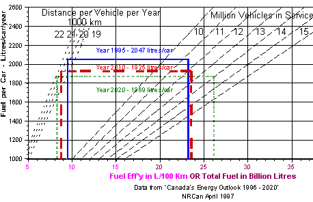
The data is plotted such that the ordinate is F/V with the abscissa either F or Litres/100 km. The two scales on the abscissa may be combined into one provided the total fuel consumption, F, is expressed in billions of litres. This combined scale, as illustrated in the Figure, will encompass the range of values required in most circumstances. It is thus possible to plot all the relevant factors - average distance travelled, number of vehicles in service, average fuel efficiency and total fuel consumption on a single graph with only two scales. Each data set is represented by a rectangle for either the year or country chosen. Since the scales are logarithmic and capable of covering a wide range, data for both large countries (such as the U.S.) and small countries (such as Canada) may be plotted on the same graph. There are two advantages to this procedure: first, lack of self-consistency in the data is made evident and, second, the changes over time for one country or the differences among countries are visually apparent.
Nevertheless, it turns out for the case of a single country such as Canada, a logarithmic plot is not necessary. As may be seen in the Figure, with linear scales, the lines for the constant average distance travelled (D) and for the constant number of cars in service (V) over the range of interest approximate straight lines sufficiently well as to be readable directly. Accordingly, data provided in Canada's Energy Outlook 1996 - 2020 (2), was plotted in the Figure in linear form.
The information provided in the Outlook included the actual and expected values for the average distance travelled for cars in a number of years including the 1995, 2010 and 2020 cases shown here, and the total gasoline consumed by all gasoline-powered vehicles expressed in PJ. This latter value was converted to litres using the factor 34.66 GJ per cubic metre (or 1000 litres) to estimate total gasoline consumption.
No information was provided on the division of this consumption between the two cases given-cars and other gasoline-powered vehicles. This proportion was approximated by using the New Vehicle Fuel Efficiency (NVFE) figures reported in the Outlook for both cars and gasoline-powered trucks: a notional total consumption was calculated for cars and trucks separately by multiplying the NVFE by the number of vehicles in each class and the average distance travelled. These two values were totalled and the percentage consumption of gasoline from cars alone derived. This percentage was then applied to the total gasoline consumption given in the Outlook to estimate the actual consumption in cars alone. This approximation assumes the ratio of actual gasoline consumption in cars to the total actual gasoline consumption in all gasoline-powered vehicles in the fleet is not significantly different from the same ratio applicable to new vehicles only. Some error is no doubt introduced by this assumption.

The Figure illustrates the increase in the gasoline consumed, both in total and per vehicle from 1995 to 2020, notwithstanding the improvement in the fuel efficiency over this period. Greater efficiency is more than offset by the steady growth in the car fleet and to a lesser degree by the slower increase in the average distance travelled by each car in a year.
The data is not completely self-consistent in that the average fuel efficiency figures derived here are too high (numerically lower in terms of litres/100 km) in relation to the NVFE data. This is not a criticism of the information in the Outlook but reflects the considerable difficulty encountered in obtaining and interpreting this information. A major advantage of this system of representation is it allows such inconsistencies to be seen at a glance.
This note has been prepared to illustrate the method which may be of interest to others. It is possible to derive the same form of graph for electrical appliances, for example. The number of a specific appliance in service, the average number of service hours, the average consumption of electricity per unit per year, and the total electrical energy required may all be plotted together on one sheet with the scale on the abscissa representing either kW or kWH to some convenient power. The characteristic rectangles obtained may then be used to compare one appliance with another.
April 1999
19 Lambton Avenue, Ottawa, Ontario, K1M 0Z6
Tel: (613) 745-6279
E-Mail: jhwalsh@ca.inter.net
Web Site: http://pages.ca.inter.net/~jhwalsh/index.html